Steal like an artist: visual design inspiration from design consultancies we admire
In another post we published on the subject of graphic or visual design inspiration, we spoke to Fjord Madrid’s visual design lead, Paco Fernández to get some tips on how to squeeze as much value as possible out of major platforms like Dribbble and Behance.
We explained how these are essentially social networks for graphic designers in which you can:
Discover inspiration to help you with your own creative ideation process
Keep up with what’s hot and what’s not in the world of visual design
Get motivated to become a better designer by picking up new technical skills
Start a collection of things that inspire you and catch your eye
Show what you can do as a designer by using it or a portfolio or, alternatively, as a source of talent if you’re a studio director or team lead.
However, if we’re forced to pick out a negative aspect of such platforms, it would maybe be the fact that a lot of the work you’ll find on there can either be of a very abstract or conceptual nature, too experimental, or untested in the sense that the idea perhaps hasn’t actually been implemented or applied in a real-world context. Because of this, it may be difficult to trust some of the ideas you find there as sources of inspiration for a real project you’re working on.
So we got to thinking about what to do when you need some more ‘down-to-earth’ inspiration in the form of real-life, current graphic design projects, and it occurred to us. At Triggers, we spend a lot of time visiting and talking to creative consultancies and organisations of all kinds, many of which are working on really great projects all the time. And when we’re not doing talking to them, we’re most likely looking for them!
Here, we thought we’d share a few examples of agencies whose creative approach we like not only because of their final work but, perhaps more importantly, because of their creative philosophy and the process that leads to their ideas.
1. Pentagram (International)
What we like about this studio
The maturity and sophistication of their visual design work and its global reach.
Run and owned by 21 partners who are all practicing designers and highly-thought-of in their fields, Pentagram brands itself as “the world’s largest independent design consultancy”. Size aside, however, we love the way there apply their design concepts to their clients’ brands (many of which are prestigious) and their commitment to trying different things in the ideation process, including stepping away from their Macbook screens completely.
Partner Marina Willer, who’s is responsible for the visual identity of London’s famous TATE Modern art gallery, has been known to including light projection, mirrors and even entire physical spaces as part of her eclectic creative process.
Which projects should I look at?
As well as the TATE Modern, Pentagram has done some great branding and visual design work for the likes of American Express and even adult romance novel publishers Mills and Boon
2. Gretel (New York, United States)
What we like about this studio
Their clear vision when it comes to design and the potential they see in it. In fact, their vision statement itself is pretty inspirational. We also love their ability to do everything from conceptual and strategic design to the implementation of the design itself.
“We believe that the most interesting work happens at the intersection of opposing forces. Old/new, high/low, masculine/feminine, order/chaos, organic/inorganic.” — Gretel
Gretel’s creative process, according to the studio itself is all about “tension, intellect and intuition”. In other words, combining an open, innovative mind with years of collective and individual experience and technical know-how to try and come up with something original and valuable every time.
The diversity of in-studio design talent is also pretty impressive, and they successfully combine everything from researchers to writers and art directors across a healthy range of projects.
Which projects should I look at?
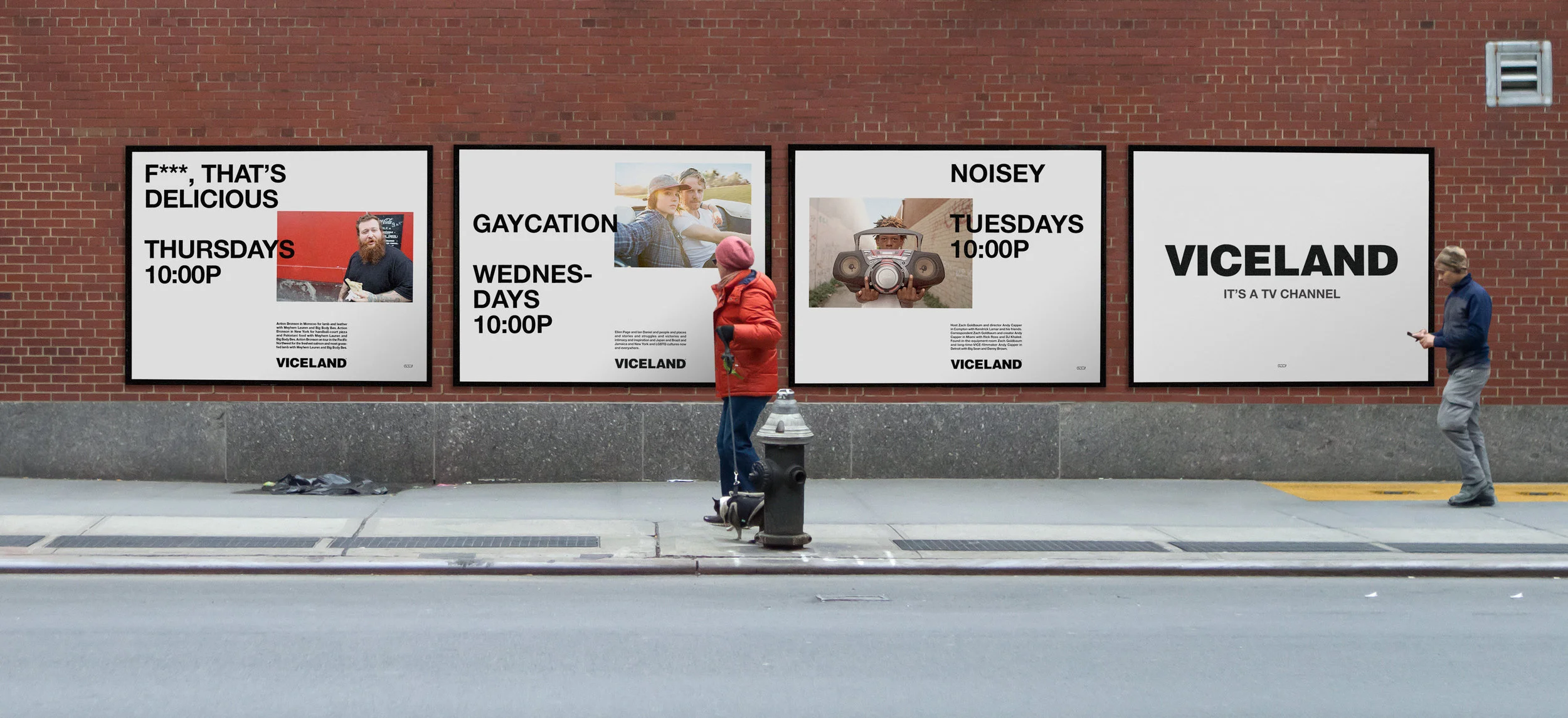
Many of Gretel’s clients will be very familiar and read like a graphic designer’s client Christmas list. Think The New York Times, and Nike. We particularly love the digital experience work they did for VICE magazine’s VICELAND.
3. Socio Design (London, United Kingdom)
What we like about this studio:
Again, in its self-description, Socio Design talks about the process behind the work it produces. It’s essentially a combination of instinct and experimentation, which are things we we’ve spoken about in the past as being key ingredients in the overall creative process. The results of this process, if you ask us, are fantastic!
Which projects should I look at?
Socio Design specialises in corporate brand identities, packaging and digital user experiences and their clients are based everywhere from London to Beijing.
Some of their projects that have caught our eye include their work for Nokia developer, their newspaper design for marketing consultancy KAE and their packaging for skincare brand Clutch Bodyshop.
These are just a few suggestions of names to get you started in your search for inspiration but, of course, there are many more agencies, consultancies and studios around the world producing some excellent visual design work. In general looking at what others are doing – particularly if they have a vision that’s similar to your own – is a great way to kickstart your own creativity.
You can also combine this with our Graphic Design deck to ask yourself and your team the kind of questions that lead often lead to original ideas.
Got some examples of studios who are doing some interactive creative work? We’d love to hear about them! Feel free to get in touch with us via Twitter or over on our Facebook page.


